


The People’s Typography Project
For this campaign, I interviewed three non-designers to see what the average person thinks about typography. I also asked for their opinions on various fonts designed by Aldo Novarese and his type foundry, Nebiolo. I then took quotes from those interviews and designed posters around them.
Aldo Novarese was a prolific Italian typographer who worked in the second half of the 20th century. Some of his most famous fonts are Eurostile, Forma, and Stop, which he designed while working for Nebiolo type foundry in Turin.
——-text of images——
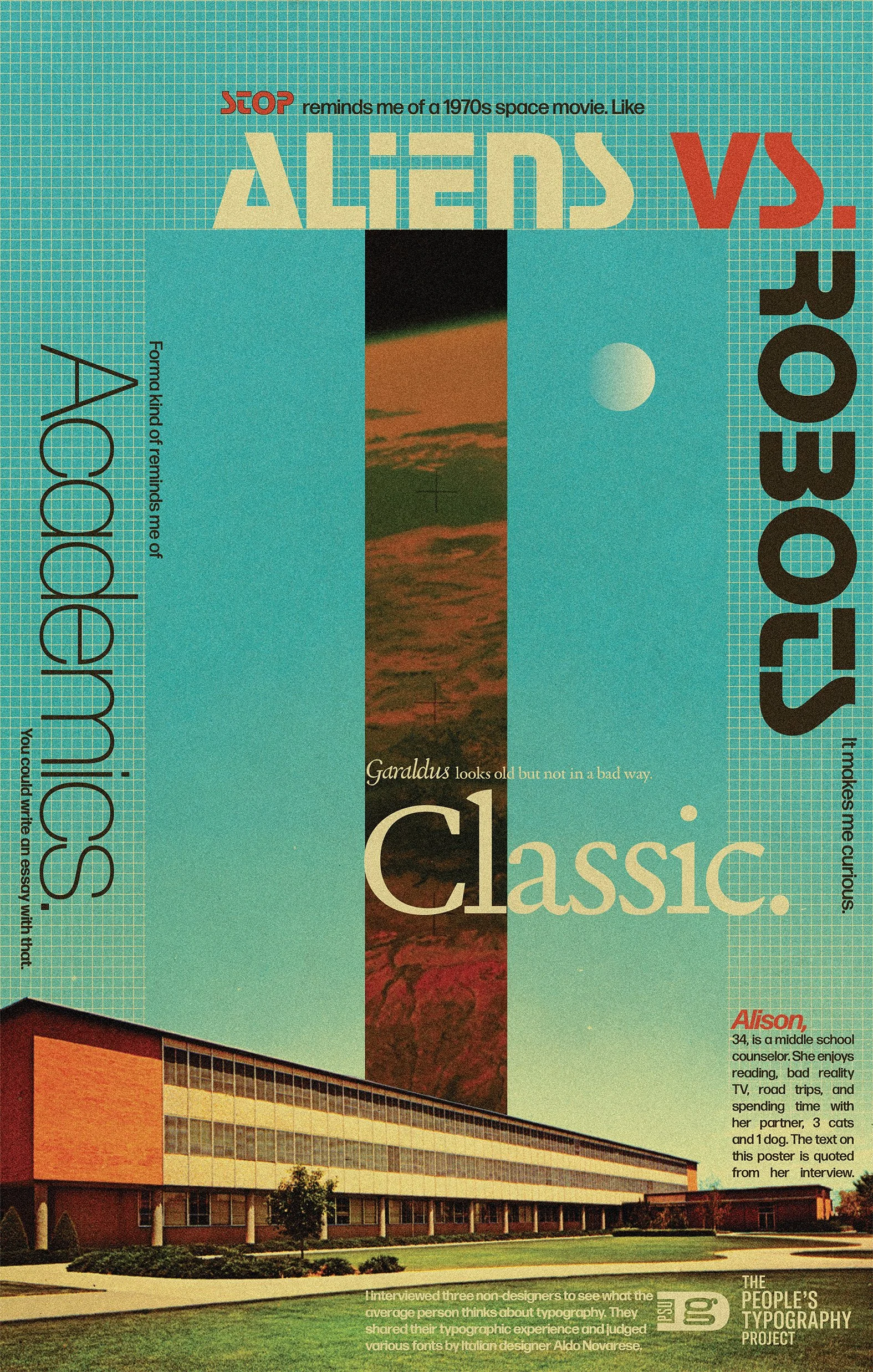
POSTER 1:
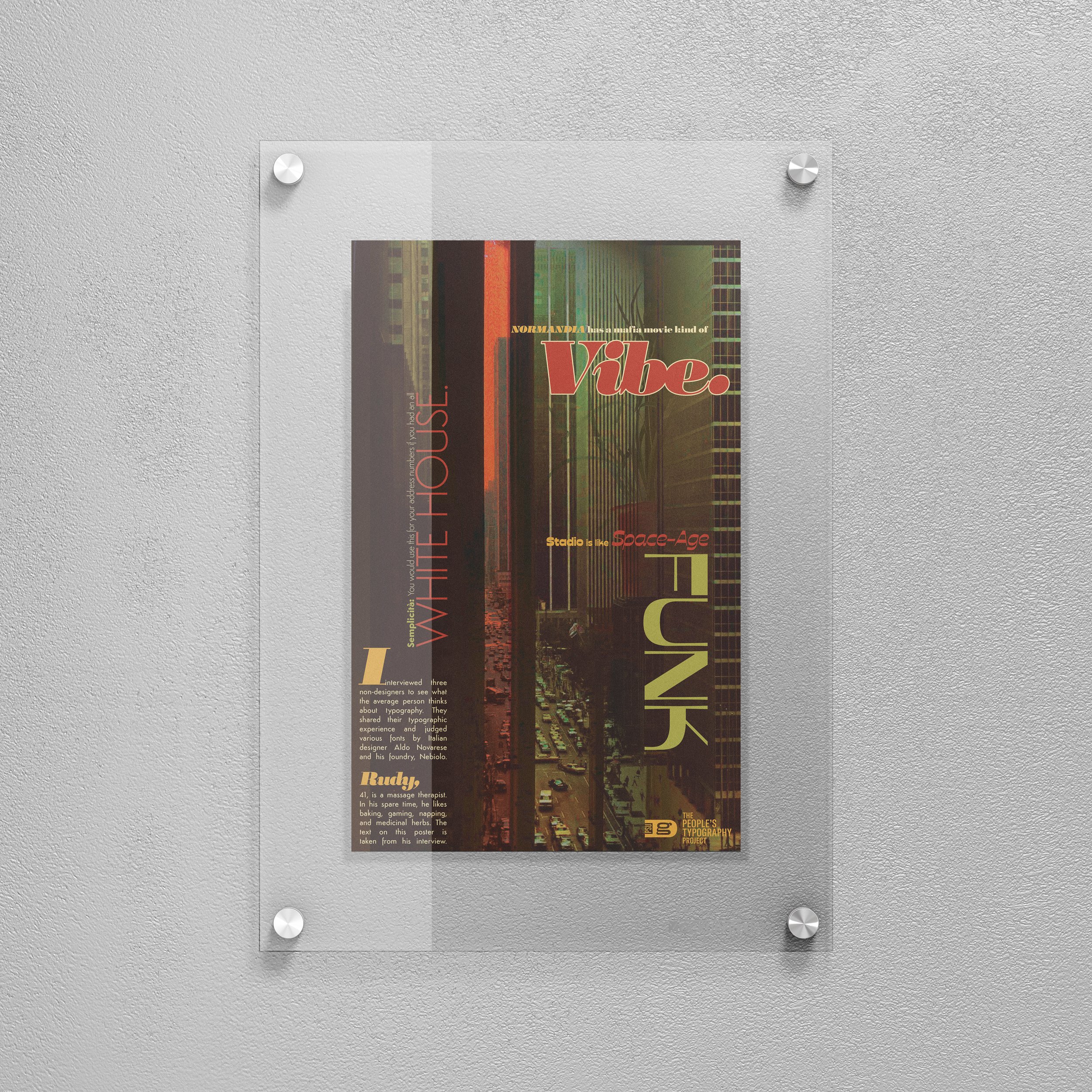
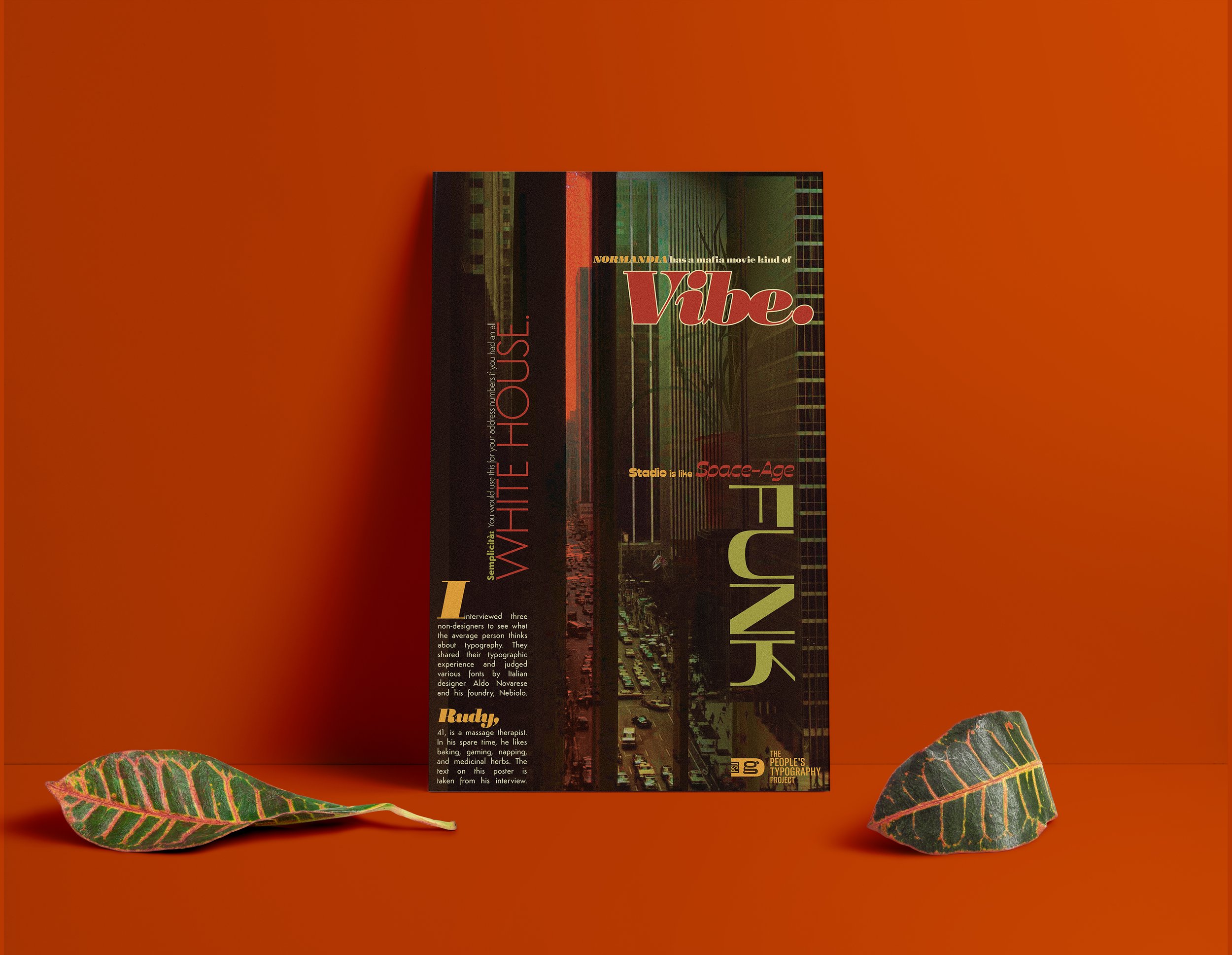
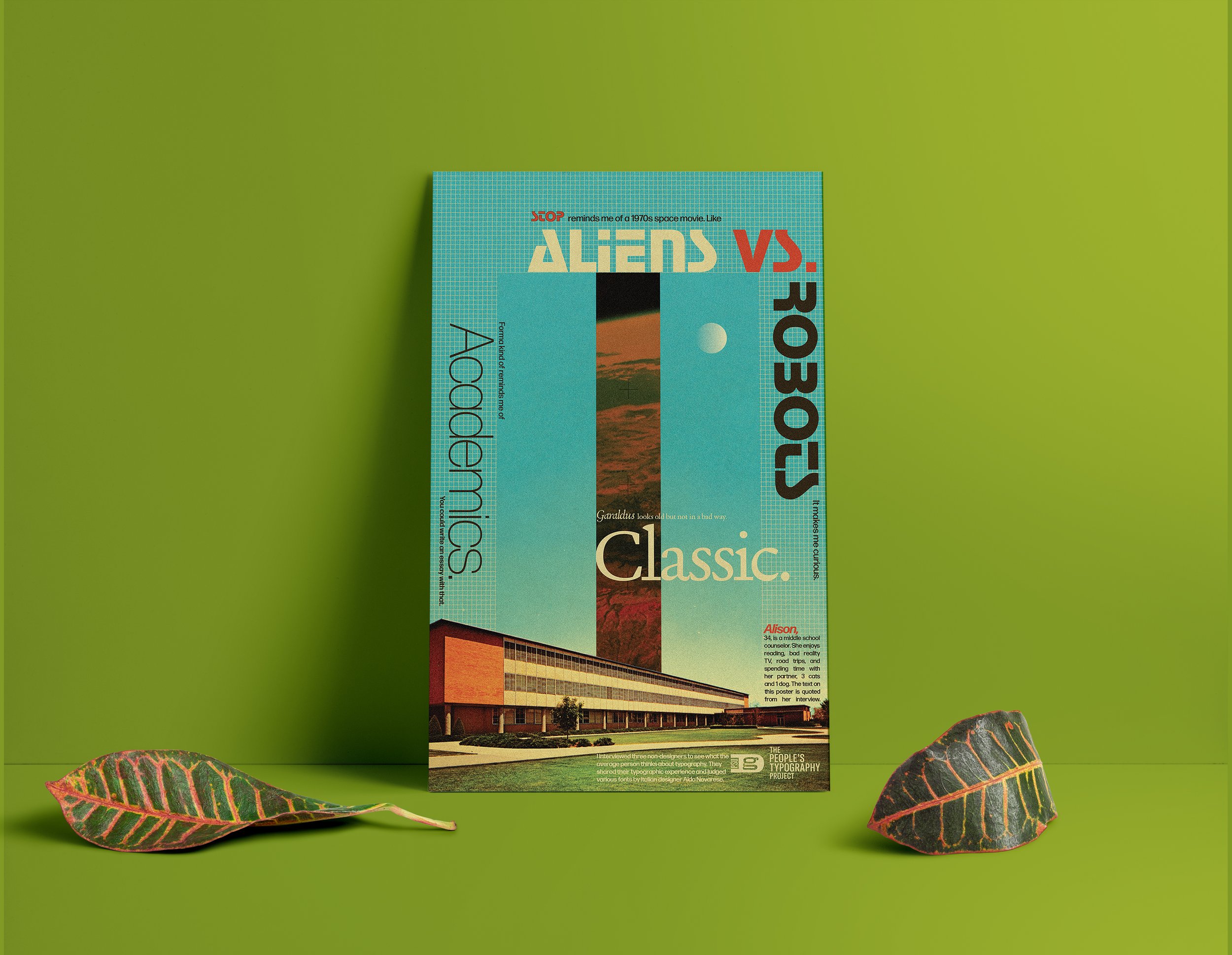
The People’s Typography Project
I interviewed three non-designers to see what the average person thinks about typography. They shared their typographic experience and judged various fonts by designer Aldo Novarese.
Alison, 34, is a middle school counselor. She enjoys reading, bad reality TV, road trips and spending time with her partner, 3 cats, and 1 dog. The text on this poster is quoted from her interview.
Garaldus looks old but not in a bad way. Classic.
Forma kind of reminds me of Academics. You could write an essay with that.
Stop reminds me of a 1970s space movie. Like Aliens Vs. Robots. It makes me curious
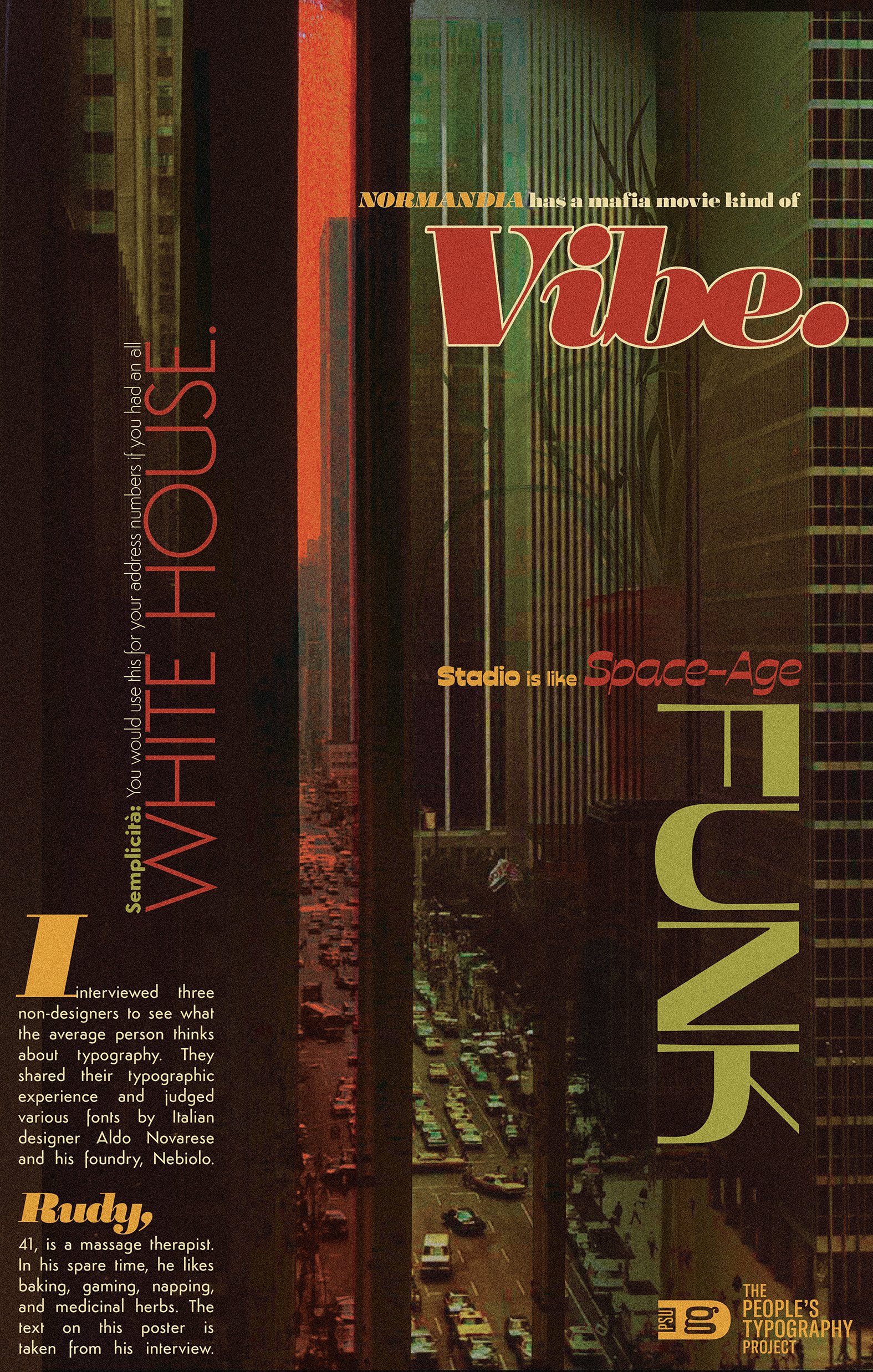
POSTER 2:
The People’s Typography Project
I interviewed three non-designers to see what the average person thinks about typography. They shared their typographic experience and judged various fonts by designer Aldo Novarese and his type foundry, Nebiolo.
Rudy, 41, is a massage therapist. In his spare time, he enjoys baking, gaming, napping. and medicinal herbs. The text on this poster is taken from his interview.
Semplicità: You would use this for address numbers if you had an all white house.
Normandia has a mafia movie kind of vibe.
Stadio is like space age funk.
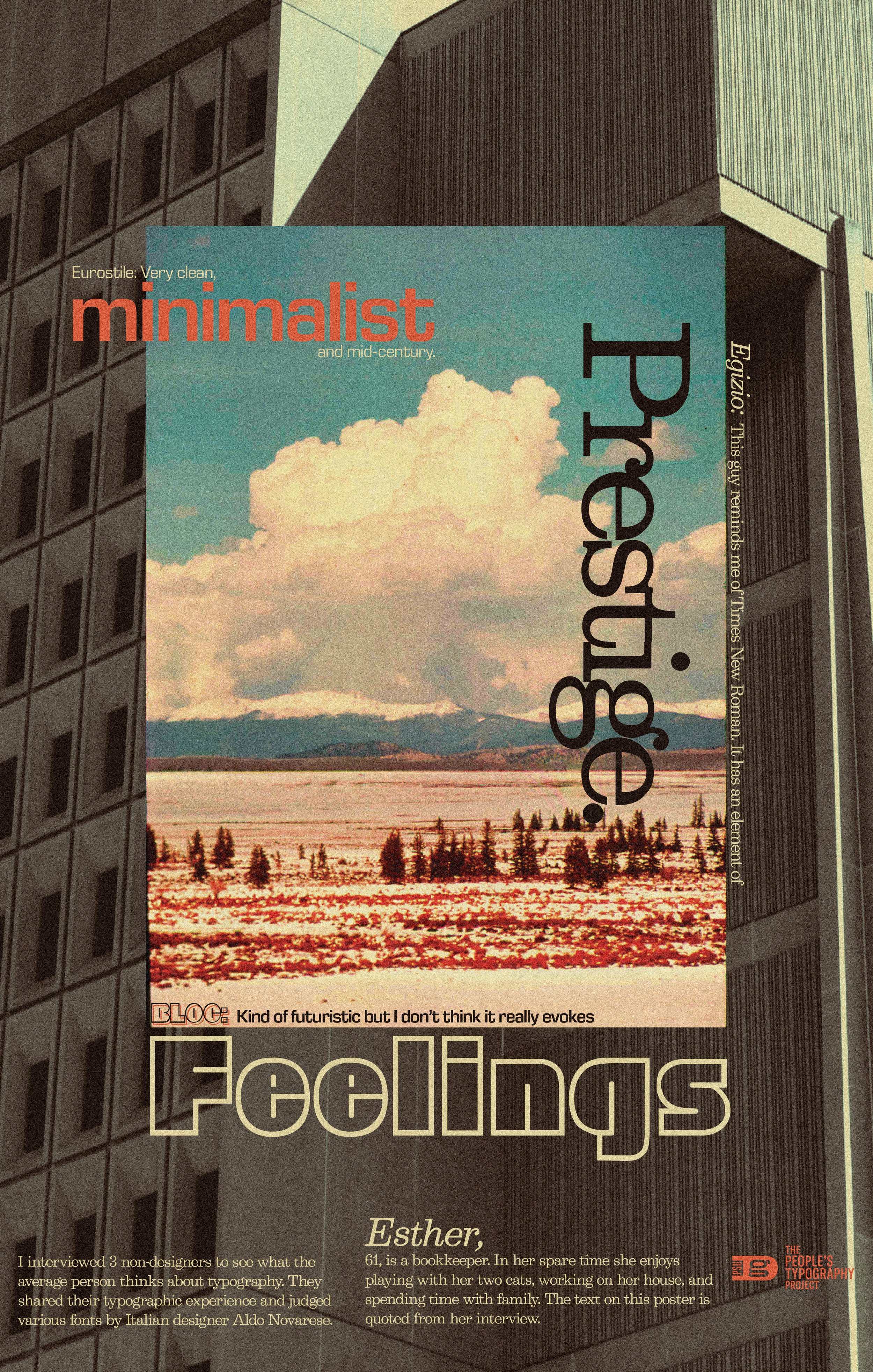
POSTER 3:
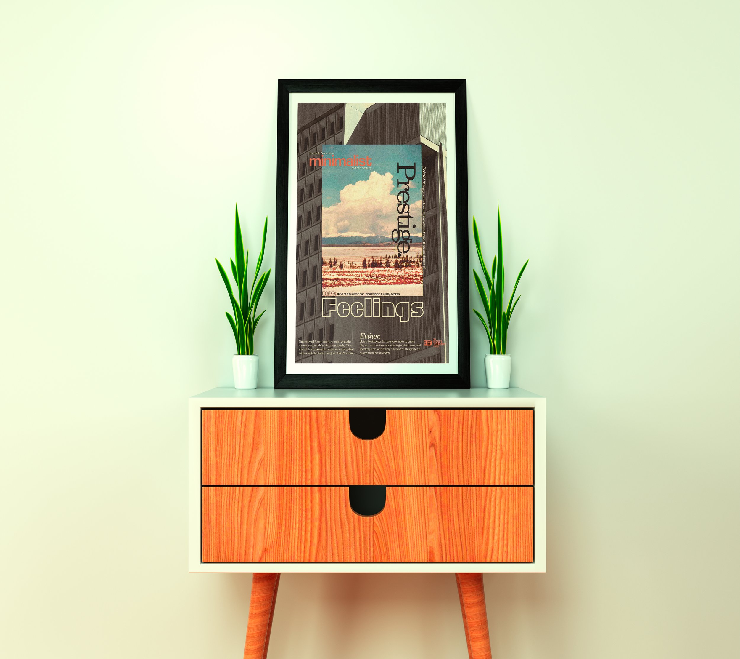
The People’s Typography Project
I interviewed three non-designers to see what the average person thinks about typography. They shared their typographic experience and judged various fonts by designer Aldo Novarese.
Esther, 61, is a bookkeeper. In her spare time she enjoys playing with her two cats, working on her house, and spending time with family. The text on this poster is quoted from her interview.
Eurostile: Very clean, minimalist, and mid-century.
Egizio: This guy reminds me of Times New Roman. It has an element of prestige.
Bloc: Kind of futuristic but I don’t think it really evokes any feelings.